

 Just a cheeky pre-edit from a shoot in hyde park with a couple of good friends! Thank you Sarah Vernon for the make up and styling and Harriet Brooks for being such a wonderful model!! Cant wait to be back in Bournemouth and start shootingg!!
Monday 3 May 2010
Hyde Parkkk
Just a cheeky pre-edit from a shoot in hyde park with a couple of good friends! Thank you Sarah Vernon for the make up and styling and Harriet Brooks for being such a wonderful model!! Cant wait to be back in Bournemouth and start shootingg!!
Monday 26 April 2010
Inspiration

Julia Fullerton-Batten's Teenage Stories are my new favourite set of images, again it is such a simple idea but done so well. Its something I want to do in the next couple of months, I just need to find the right location! I needed some inspiration as I'm stuck in Essex so I'm starting on my personal work, as well as playing viva pinata!
Monday 12 April 2010
CAP


After last weeks blog showing my DD work I wanted to also put up my final CAP images. After several test shoots with different models I was able to put together 6 final images. I wish I could have done more however finding these 6 did take along time. I would rather have 6 strong images than 8 with weaker ones. I am really pleased with these, I did however use all digital files in the end, but I would love to go back and shoot more in film. Hopefully when I get some free time I can clean up the film scans, rather than leaving them in a folder! I styled these photos myself and had a make up artist come in for the hair and make up!
Tuesday 6 April 2010
Gaia
With all our hand ins out the way I now finally have some time to relax, so I thought it share my two final images for the Digital Darkroom project. I have not really written about it on here so here I go! The project was to look at Gaia and shoot two photos for a magazine. I chose to do fashion and the idea of recycling. I wanted the idea to lead on from my DISP work as I loved creating the image, however I did not want to do it all in photoshop, but rather build something in the studio. I did not want to do the traditional dress made out of news paper and create something at a bigger scale than my DISP. I wanted to create a recycled refuge for the 'last beautiful people' using clothes and pretty objects to create it.

This is the double page spread for the magazine, I used shirts and lampshades, adding in a few things on photoshop and playing with the tones until I found something that worked.
 I wanted the front cover to be more punchy than the double page spread, I used the same type of editing. The origional was very bleached out so I spent along time reconstructing her hat, adding most of the texture back in to the highlighted areas.
Monday 29 March 2010
Angelas Bike
 The One Eye Land website has so many amazing photos and this is one that really caught my eye. I loved the simplicity of it, although it is not a completely origional idea it has been done in such an interesting way. It must have been done in photoshop and reminds me of my disp project. It looks so realistic, I love the colour in the balloons as it brings out what is happening to the bike. I should really start doing simple stuff like this! As it works so well!
Wednesday 24 March 2010
Armani
 As I looked more into androgyny in fashion I found more images for my project, I found this as one that really inspired me. I love how the model is very natural as if there is nothing 'wrong' with this image, well in this day and age there is nothing wrong with it, however it would have been seen as something completely controvisial in a different time. The look of this image is something I do want to intimidate, rather than creating in your face images. I think the approach does have to be soft for it to really work, holding beauty as well as that perfect balance between masuclin and femine. I have been researching alot into fashion theory and how I should go about photographing my images.
From my reserach I decided to do another test shoot, the image is not perfect (the crop is not right) I decided to try a sterner look with the model, however I found it was not really what I watned to create, it was not femine enough.
 I wanted to compare it to the first style of image I shot, so here is another image from the shoot, it has not been fully edited but shows how it works better than this harsh approach.
Monday 15 March 2010
Tim Walker
 Alot of people love Tim Walkers work just because it is 'Tim Walker', so he is somebody I tend not to write about and admire from afar. However with our Digitial Darkroom project I wanted to create something quite magical, so I thought this was really a starting point. I do love this image, his work is always at such a big scale, unrealistic to recreate but breath taking to look at. I chose this image because it doesnot feature people in it, it is something different which is really interesting! For my project I want to look at large scale photography, and try and create something myself in the studio.
Monday 8 March 2010
Emma


 These are some more shots I produced from my second shoot for my CAP project, after researching old photos I styled the images and called in a make up artist to help me give a masculin look to my female model. I shot in film and digital, the top image is film, which has a slightly different colouring to it from the postproduction I did. I wanted to include it to show the difference between the two. I wish I had more time to shoot it in film and achieve some better shots. Overall I was really happy with the results of the shoot, and feel it came such a long way from my first test shoot.
Tuesday 2 March 2010
Paintinglike
 After my test shoot we had a crit where I was told the images looked very much like paintings. This week I have chosen some photos that I think also have this same look. The first I found on model mayhem (after a new found addiction to it) when looking through photographers and models. I thought the girl was really interesting, the light behind her does add to the image, however it can be faulted. I don't like how it suddenly becomes darker, it has this softeness to it then just looks marked. I think the painting look is achieved by the model and the styling, how she is posing and her expressing.
Wednesday 24 February 2010
Yearbook


For my CAP projects I decided to look at androgyny, basing it on 50s rock 'n' roll icons. Alot of my inspiration came from Sebastian Faena. I wanted to base my images on photos of icons like Buddy Holly and Elvis and really wanted to stick with that idea, however as the shoot progressed I found that the model I had found was very serious and the concept didn't really suit her. From doing this shoot I found that the origional ideas I first had needed to work with the whole theme of 'classic'. I could either go down two very opposite routes, a very serious route or a light hearted one. I decided the more serious one would probably suit me more. I also wanted to shoot in medium format, so below is an image on 6x6, the light is slightly off and there are still dusk marks, but I do love the feel of it. I chose to make it into quite a golden tone as I felt it did suit it. I think I have made some strong foundations for this project.


Tuesday 16 February 2010
Juergen Teller
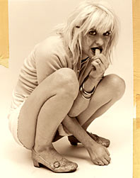
Juergen Tellers work really interests me, with my current work I feel more interested in pretty girls in pretty clothes and the images I produce will not capture the true person I photograph. I recently wrote an essay for uni on "What makes a good portrait" which made me think a lot about who I photograph. As I develop in my course I find I do want to produce fashion images and that makes me feel shallow and that I should be taking photographs of true people. I like some of Tellers work but others of it I cant stand to look at, but then because of that initial wince from them I find myself becoming more interested in them. This photograph of a Courtney Love is one I absolutely hated when I first saw it, but then I looked past how the image 'looked' and realized it shows something that I hadn't quite understood yet. Teller captures her as a person not a mannequin.
I wanted to respond to Tellers images, I have always been interested in self portrait so took one as I had these thoughts on his work.

Saturday 13 February 2010
New York

On the 8th our course took a trip to New York, it was a good few days of Dan dragging me around the streets and the subway and a chance to eat nothing but pizza and cheese burgers for every meal! The main objective however was to meet a couple of photographers and take our own pictures! We met Platon and Phil Toledano who were really inspiring to have talks from.


Tuesday 2 February 2010
Balloon Breakfast!

I think this photograph is whimsical, fun and totally gnarly! The plate was commissioned to be made and the breakfast created from balloons! At first I wasn't sure what was going on but when I realized I was amazed! I love the green gingham background as it adds a busyness to the simplicity of the subject. By having an arm left in your see how it was created! I love photos like this! I wish I had thought of it!
Sunday 31 January 2010
Patterns

Steven Meisel: Vogue Patterns

Sebastian Faena: Pop True Faith
At the moment I am quite interested in photographs which blend into the background, looking through Art and Commerce I found a variety of photos that really inspired me. The first is Steven Meisel, his Vogue Pattern editorial is really interesting and feminine. I like the way it takes you through these different colours and well thought out materials, especially here as her dress flows out onto the floor. The women are transformed into the material, their skin is drawn on to with stars and pin-up girl like tattoos which really interests me. I find these photos indulgent, elegant and stunning to look at as they do something that traditionally shouldn't work.
The second image is by Sebastian Faena for Pop Truth Faith, I love how it is the complete opposite to Meisel. I find the image nude, the colours are all very similar skin tones and the model blends into the attire she is wearing. The idea is the model is dressed up like a nun, then conflicting that idea by the implement of nudity. I believe it has some relation to the concepts of rock 'n' roll as she model has a quiff, I find this interesting as the 'bad boys' of rock 'n' roll who celebrated sexuality and ended the age of innocence. Perhaps it is saying true faith is that rock 'n' roll life style. The nude colours could connote sex, the cigarette being drugs and the hair style rock 'n' roll?
Thursday 21 January 2010
Richard Burnbridge

At the moment I am trying to think of ideas for new projects. I want to get into taking fashion images, I have always been interested in looking at them but never confident enough to do it. I am therefore looking at different fashion photographers and how they are taking them! I am more interested in the posing and how to make my photos look professional and beautiful! This photograph caught my eye when researching. I love the movement in her body and hands and how her head is still. The photo itself does not really inspire me but the pose and idea of movement does.
Wednesday 13 January 2010
Storm Troopers


On Flickr I found a load of photos by somebody called Stefan! He's not a professional photographer but I found so many of his photos funny and interesting, especially this one (probably because I love the colour red). I think I am being draw to quite simple yet well thought out ideas, such as the balloon breakfast! I love how all of these are just him setting them up and taking the photo! Rather than something unbelievable in photoshop!
http://www.flickr.com/photos/st3f4n/page3/
Tuesday 5 January 2010
Ian Crawford
 I looked at Crawford's work when exploring ideas for my DISP project. I especially liked this one. His work explores texture and freezing movement, all whilst the models are beautiful and unnerved by whatever is hitting them! I love the shape of this one and the way he has captured that moment the powder hits her face. It amazes me how it has been captured and really opens my eyes to new ideas!
Subscribe to:
Posts (Atom)
The Etsy Awards - One Year On
I can’t believe it’s been a whole year since I won the Etsy Awards. Time has flown by and my small business has grown so much. Winning th...
